
AirAsia
The Malaysia-based airline AirAsia flies to countries at low costs.
team
Adilah, Nate, Rakeeza, Sylvia, Zioedy
role
User research, usability testing, wireframing & prototyping
timeline
background
Our client hopes to reduce the number of air traveller contacts at airport counters and kiosks by encouraging more users to check in via AirAsia's mobile app. The app allows them to access their e-boarding passes.
They received feedback from their guests that the boarding pass information was too cluttered, making it difficult for them to find the boarding information.
4 weeks

problem
How might we increase the number of customers checking in using the mobile app?
discover
What to find out
We defined the following objectives and questions based on some hypotheses we had already developed:
Understand
needs, motivations and challenges with mobile check-in flow
Identify
actions taken by customers in current check-in process and what they expect
Evaluate
the reasons for choosing to complete check-in at airport counter instead of on mobile
How to find out
Competitive Analysis
We wanted to compare how other airlines' mobile app works and what we could learn from them. But due to access limitations, we could not thoroughly evaluate apps, so we relied on screenshots and tutorial videos online.


Low-cost airlines IndiGo, Jetstar, and Citilink offer mobile check-in apps
User Survey
To gather the attitudes and behavior of our users, we posted a survey with closed and open-ended questions and received 42 responses from Indonesians, Malaysians, Singaporeans, and Thais.
31%
Users picked to use the mobile app to check in, 43% picked the website
36%
Despite differences in boarding pass formats, both paper and digital users cited having back-ups
30%
The amount of manual labor required was ranked as the most challenging activity by most users
As a result of Affinity Mapping, we have discovered the following trends from the survey findings:
1. Convenience
Users picked the check-in method that they felt was more convenient
2. Back-ups
Despite differences in boarding pass formats, both paper and digital users cited having back-ups
3. Less manual effort
The amount of manual labor required was ranked as the most challenging activity by most users
"Digital for convenience, paper as a backup. Never know when your phone will go cuckoo or have a flat battery."
User Interview
To gain a deeper understanding of our survey respondents, we spoke with 3 of them, two Indonesians and one Thai.
The following factors also contribute to mobile app usage:
1. Travelmate(s)
The group size and whom they are travelling with
2. Travel Frequency
They wouldn't consider downloading the app if they don't travel with the airline often
3. Data Connectivity
They can't access the app if they don't have good wifi or network connection
Usability Testing
We asked five users to go through the check-in flow and express their thoughts about the process and what could be improved.


At the end of the interview and usability testing, we asked users to rate 10 SUS statements from strongly disagree (1) to strongly agree (5). The final score is calculated by averaging five users' SUS scores.
“Last time I travelled with my parents three years ago, we used paper simply because we brought our parents, and we didn’t want to burden them by using apps.”
define
Who the target users is
We defined the user personas to describe the target users' attitudes and behaviours and help us in the design process.

Farah Nazim
Age 33, Indonesian
Fashion Merchandiser
As a young mother and educator, Farah reads up on how to maximize her time. She can check in via the website or mobile app to do it whenever it is convenient for her. Ideally, she would like a quick and customizable experience.

Lim Sim Lok
Age 54, Malaysian
Primary School Teacher
Sim Lok is a teacher at heart. He always tries to keep up with technology despite not being very tech-savvy himself. As a precaution, he prefers to have a backup plan. For him, it is necessary to have a simple and easy-to-use app and a backup copy of the boarding pass.

So,
How might we enhance the ease of use to increase the number of customers checking in using the mobile app?
design
How to solve the problem
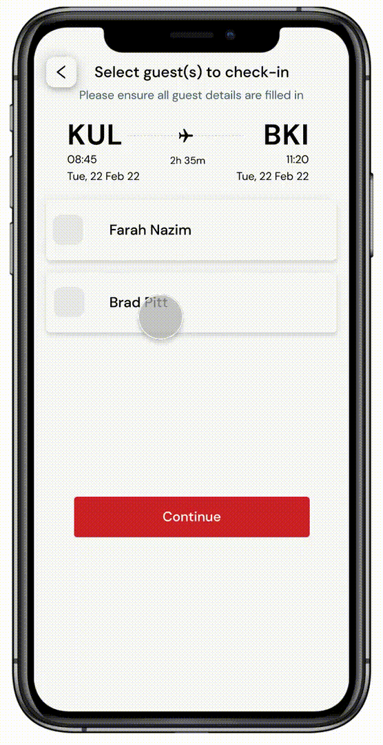
Check-in guests
The flow of checking in multiple guests confused the users because they had to go back and forth between two pages, select the guest's name, fill in guests' details, and then return to proceed.
To remove that repetitive flow, users select the guests and fill in the details continuously.
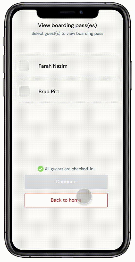
View boarding passes
Users complained that the app could not display multiple boarding passes and had to go back and forth to select the guests.
We suggested that users select multiple guests, and cards of each guest's boarding pass are displayed on a single page.
Boarding pass layout
Users pointed out that there were unfamiliar codes on the boarding pass. Then the baggage tag QR code was under the boarding pass barcode. Both barcodes were too close together and could cause an error.
By using bright red, we made it easy for users to focus on the boarding information. The QR code for the baggage tag is separated from the boarding pass and can be revealed by tapping it.

Text field & button labels
Users have voiced concerns about inputting incorrect data if they do a self check-in, so they prefer heading to the counter for check-in instead. The usability test revealed that users misunderstood input fields and buttons such as:


As we redesigned the form, we added placeholder text to let users know what to type in the specific text field and renamed the button and label such as:


result
We conducted usability testing with five users, asking for their reviews and rating for 10 SUS statements.
Website's score
Prototype's score
68.5
vs
84.5
23%
SUS Score increase
80%
rated 5/5 for the interface
"I'm satisfied with the output and research given the limited resources and time. It gave us another perspective of potentially solving the issue using simpler approaches."
- Chris Ng, Lead UX Designer from AirAsia
Where we can improve
Despite our best efforts, we could not conduct enough user interviews due to budget and time constraints. As a result, we had to enlist the help of friends and family, which wasn't ideal. In addition, with only three interviews, the insights gathered may not be enough to identify the real problem.
What next
1. Expand user research on app downloads attitudes and behaviours
-
Current users’ motivation
-
Potential users’ reluctance
2. Assess the holistic check-in process
-
Share the app download access link via booking confirmation emails
-
Send access link to in-app boarding pass via email or SMS to website check-in user
-
Optimise airport self-service check-in kiosk